
Kompaan Craft Brewers
-
Client:
Kompaan
-
Type of work:
Branding, Strategy, Identity
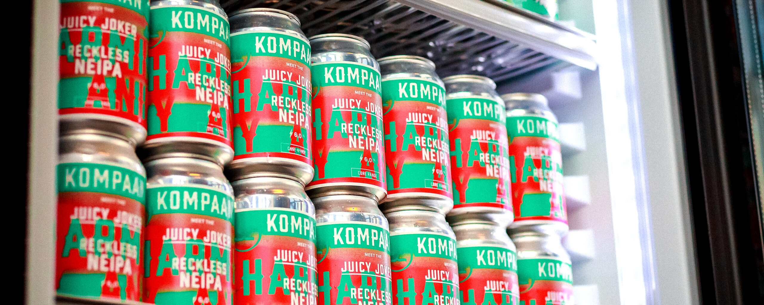
Kompaan is the largest microbrewery in The Hague and the only one with a self-owned brewhouse. Since 2014 we are responsible for their graphic identity and branding. We started out with the overhaul of their Core Range beers and corporate identity. Over the years our collaboration with Kompaan has spawned multiple marketing campaigns, new beer series, new locations and lots of one-off label designs.
In 2021 we won a platinum trophy at the international Craft Beer Marketing Awards for our design of that year’s Foreign Legion barrel-aged beer series.
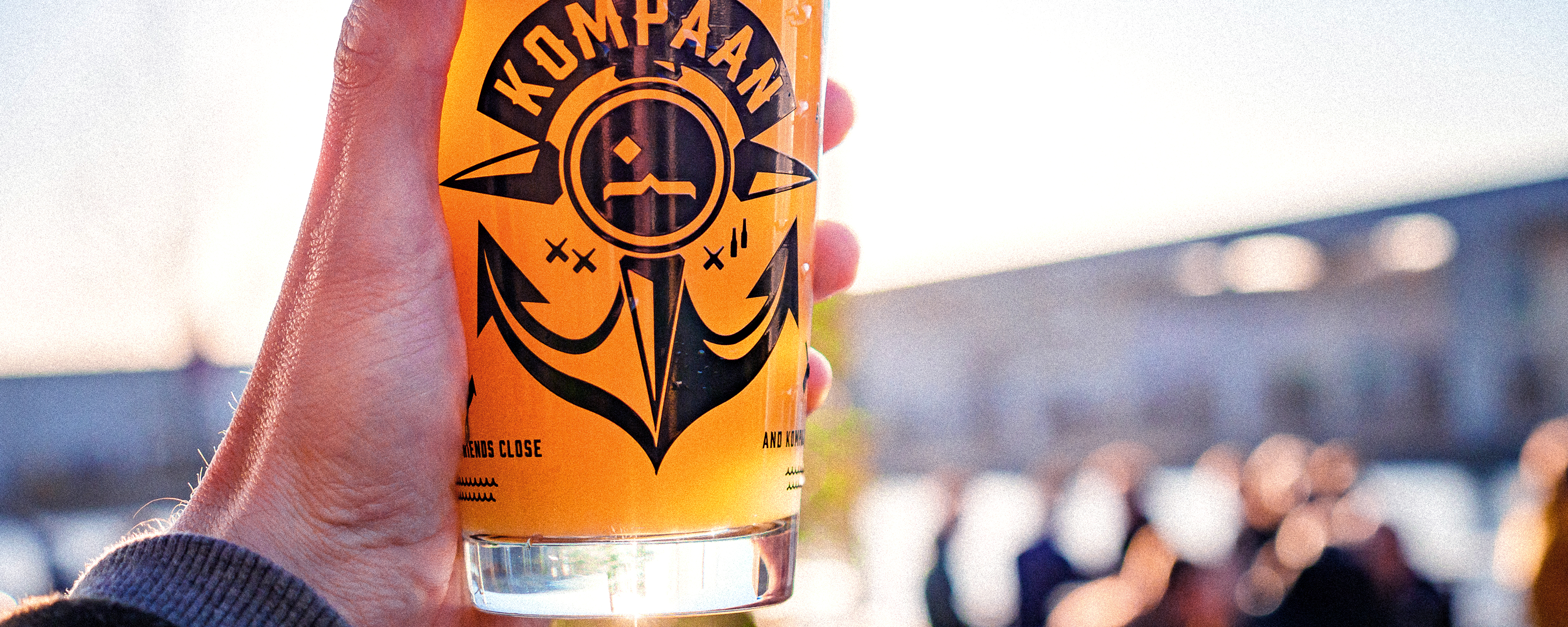
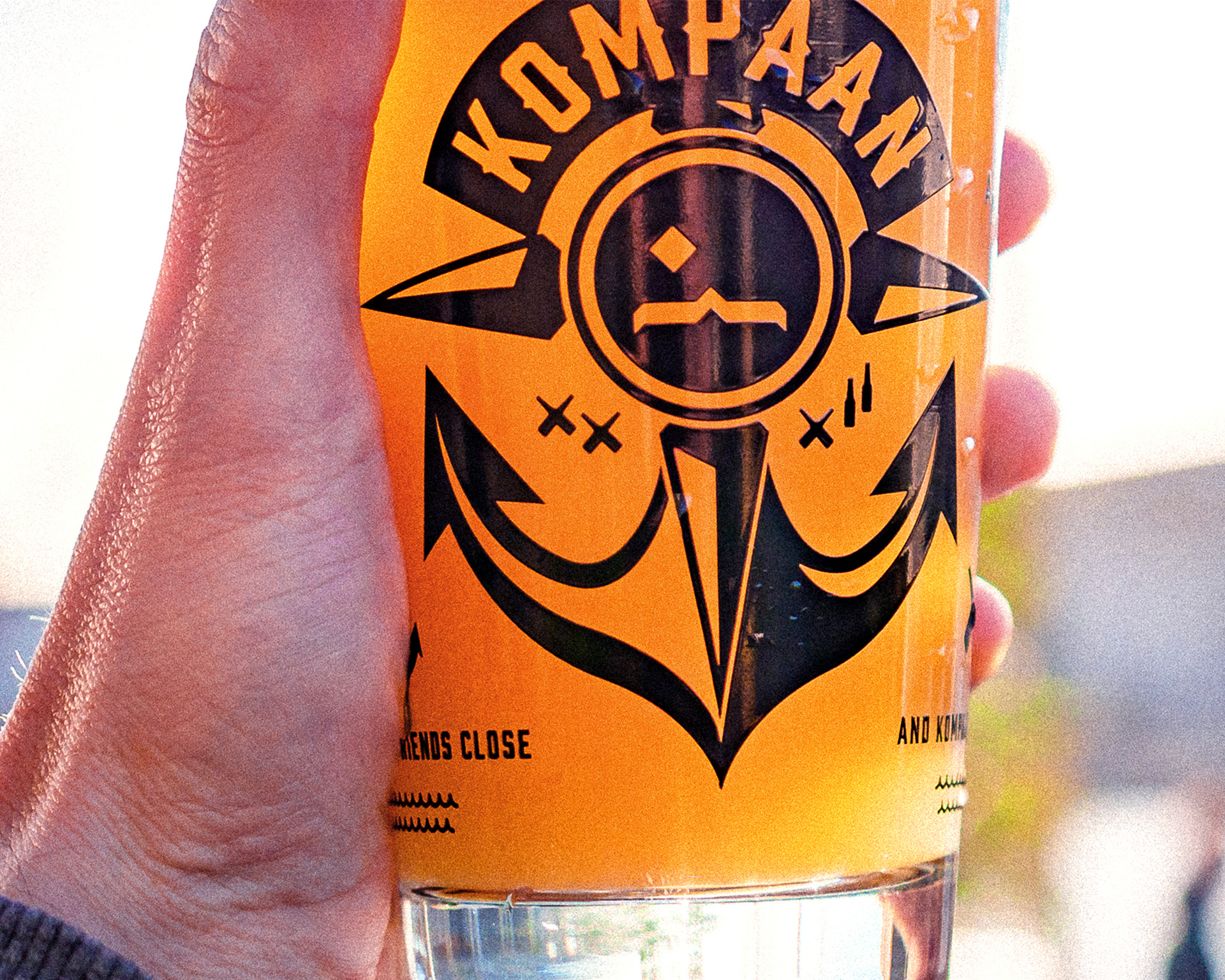
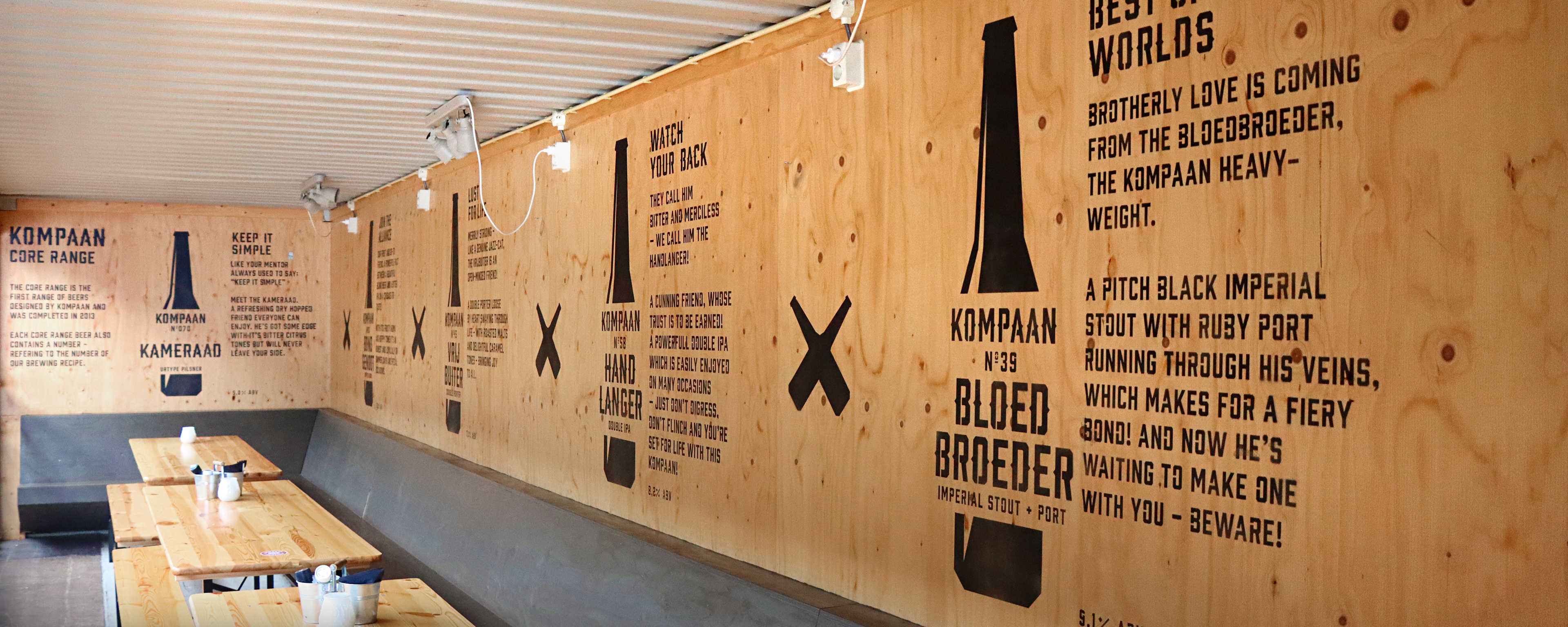
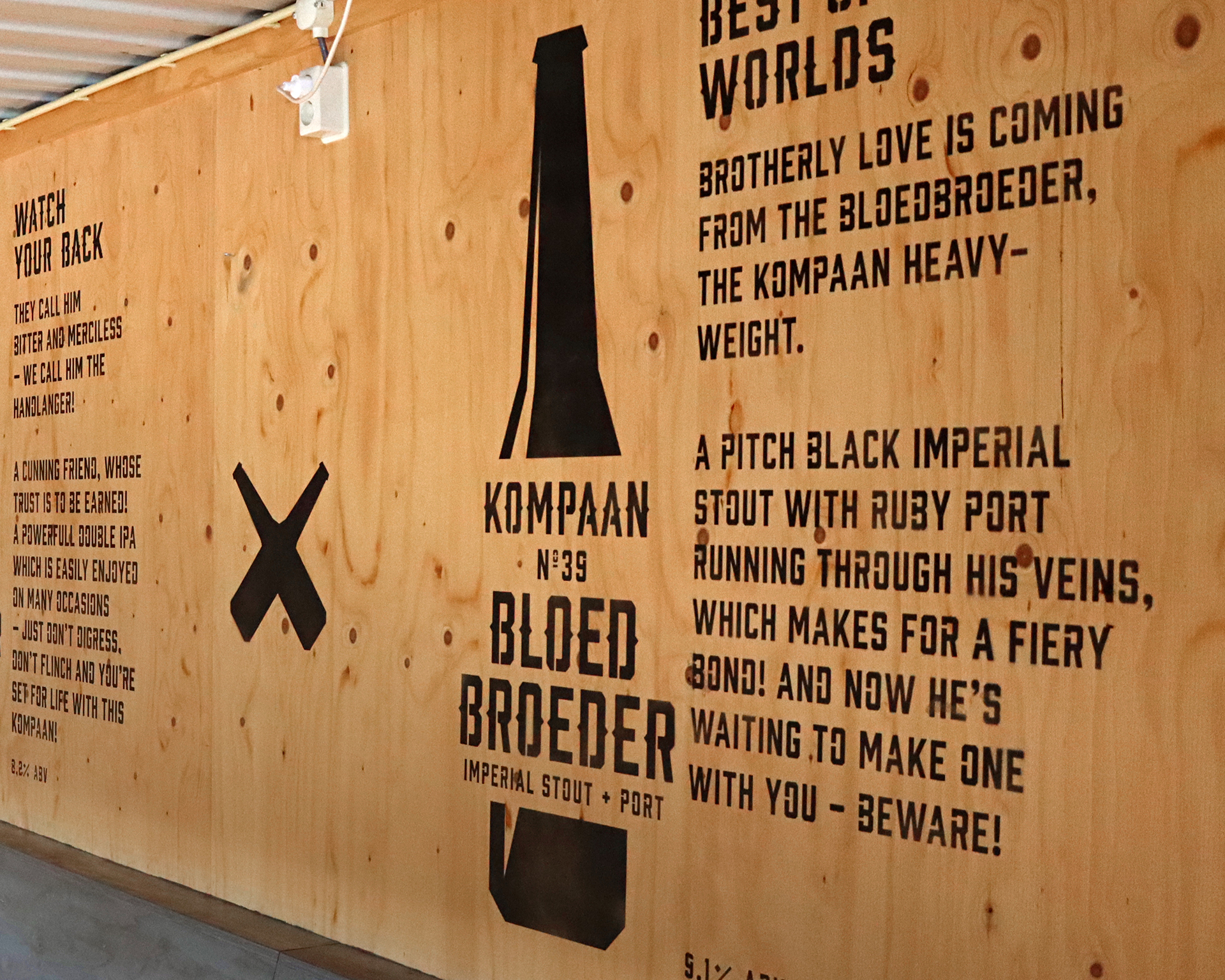
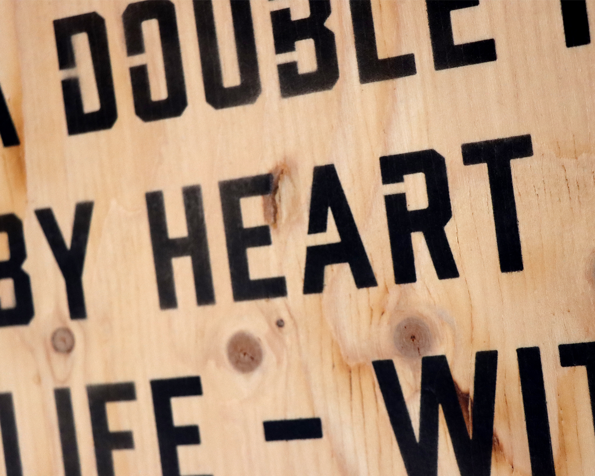
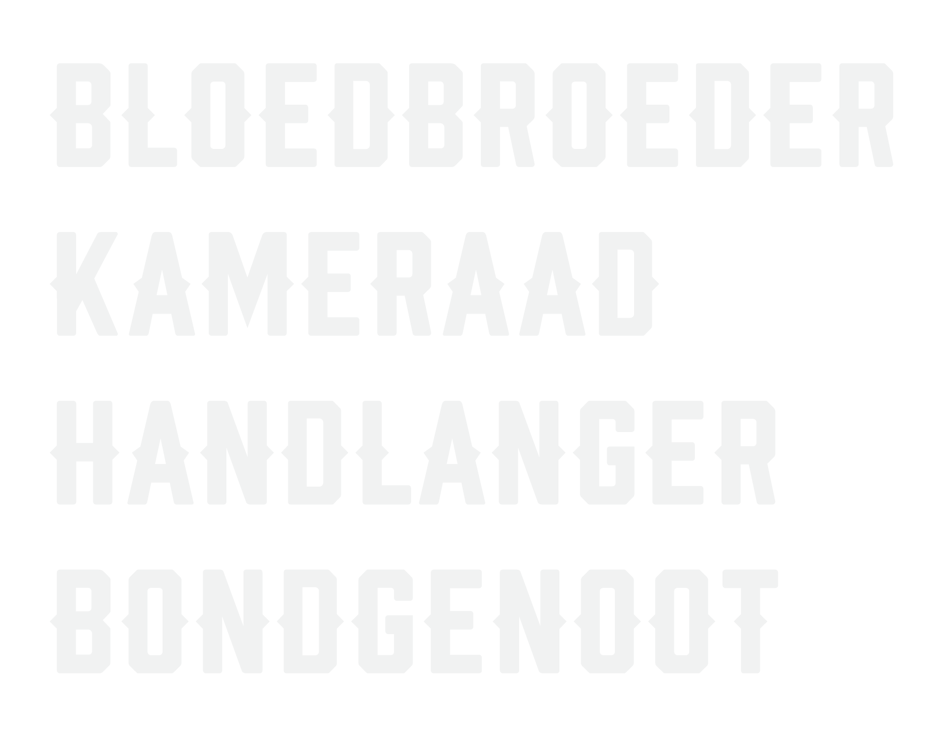
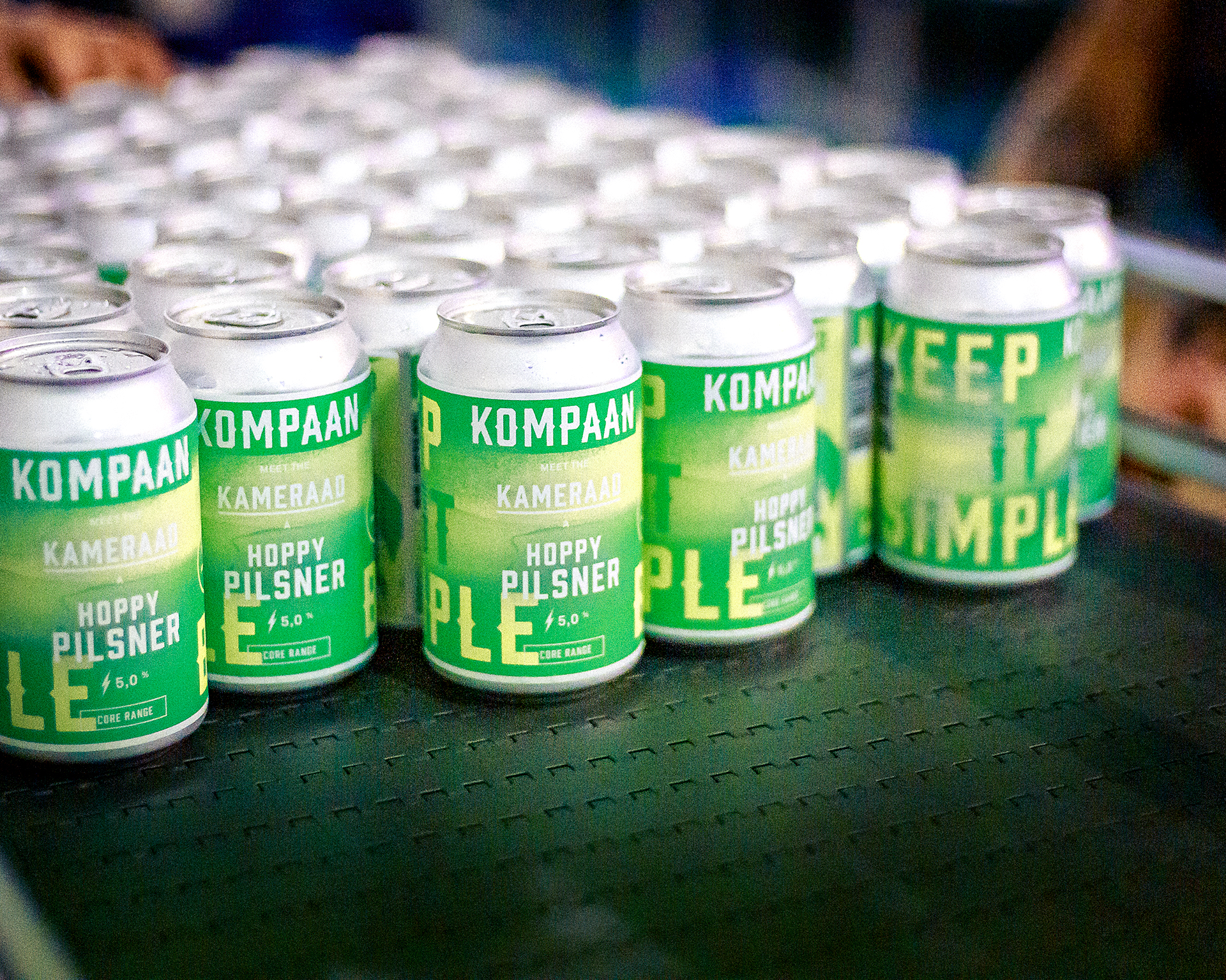
Kompaan roughly translates to ‘buddy’ in Dutch. At the base of the graphic identity, we designed a custom typeface reminiscent of biker colours typography (the patches they wear on the back of their jackets) to invoke a brotherhood kinda feeling. Because of the brand name, friendship is the core brand value. This is extended into the concept for their Core Range beers. All the names are synonyms for a different type of friend. Kameraad, Bondgenoot and Bloedbroeder etcetera. (Translation: Comrade, Ally and Blood Brother)
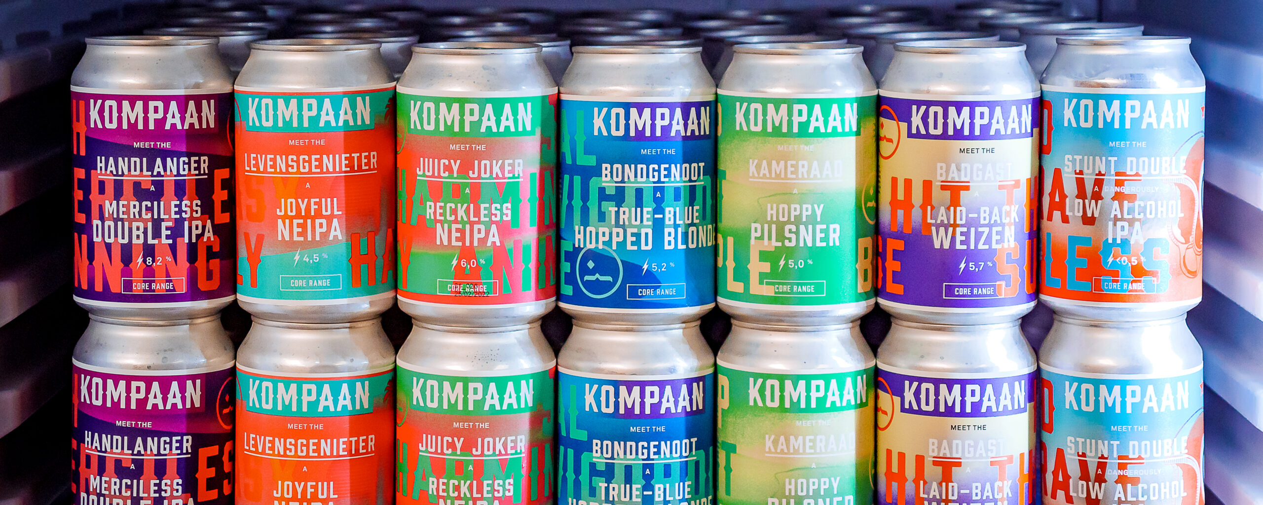

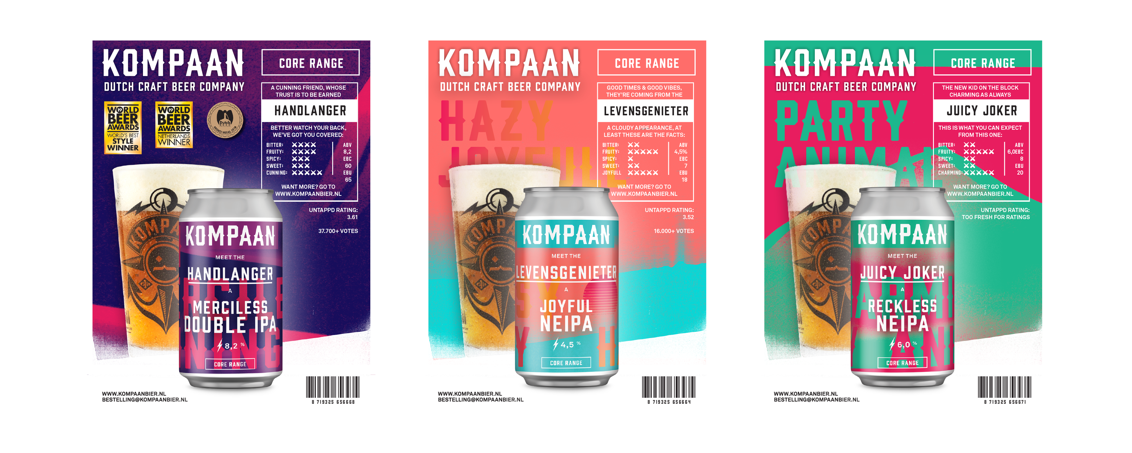
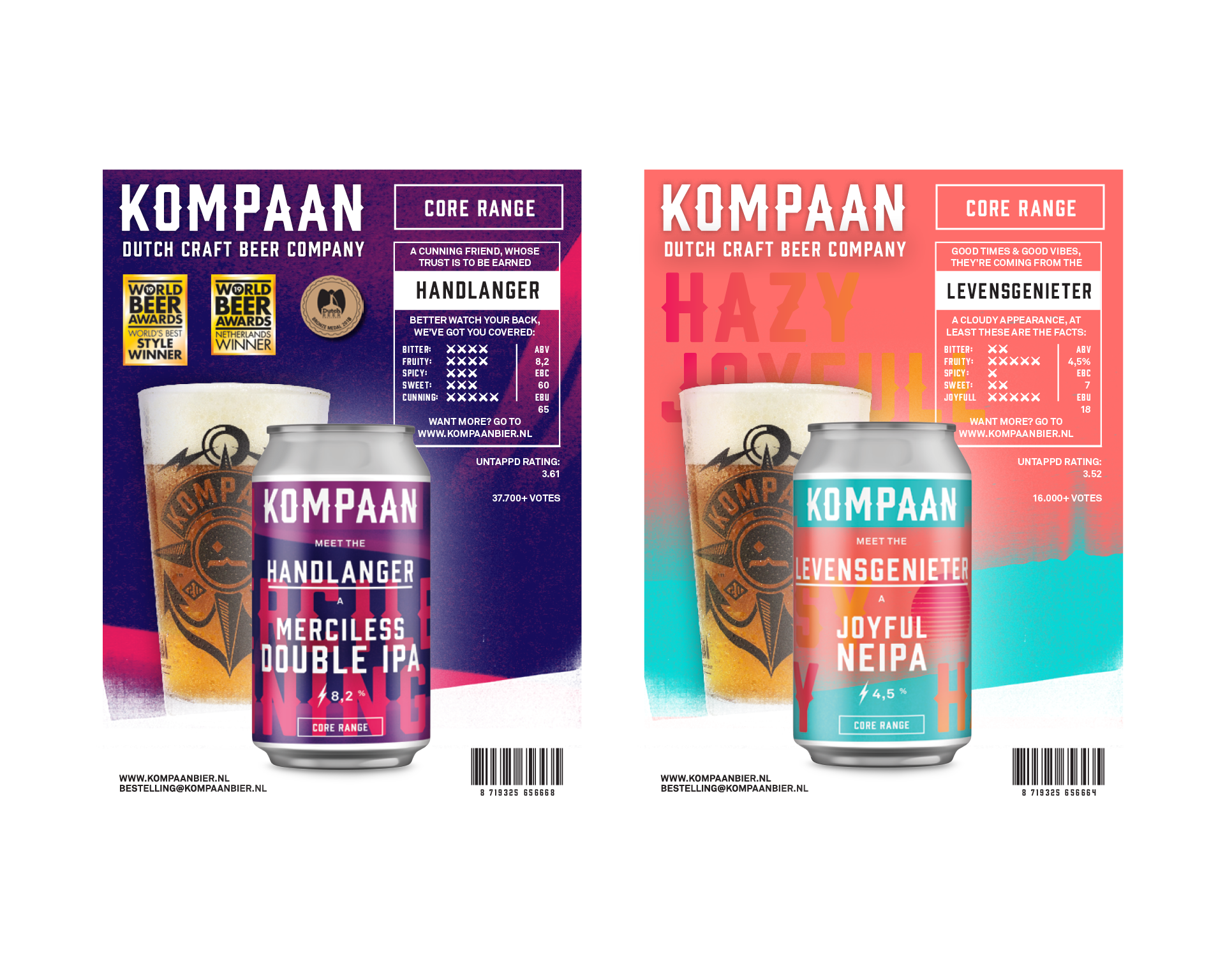
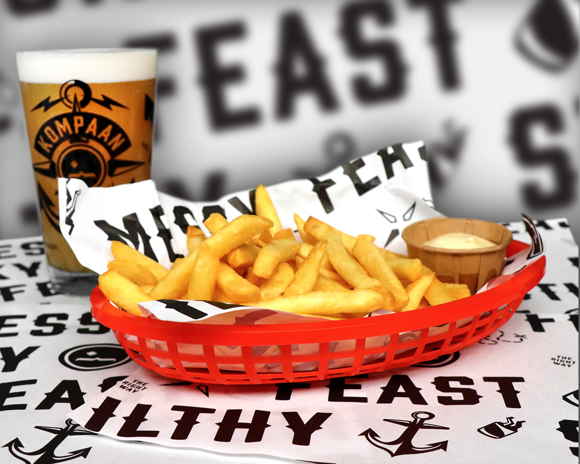
Product sheets for the sales and marketing department.
Next to the custom typeface we designed a series of graphics to complement the visual identity.

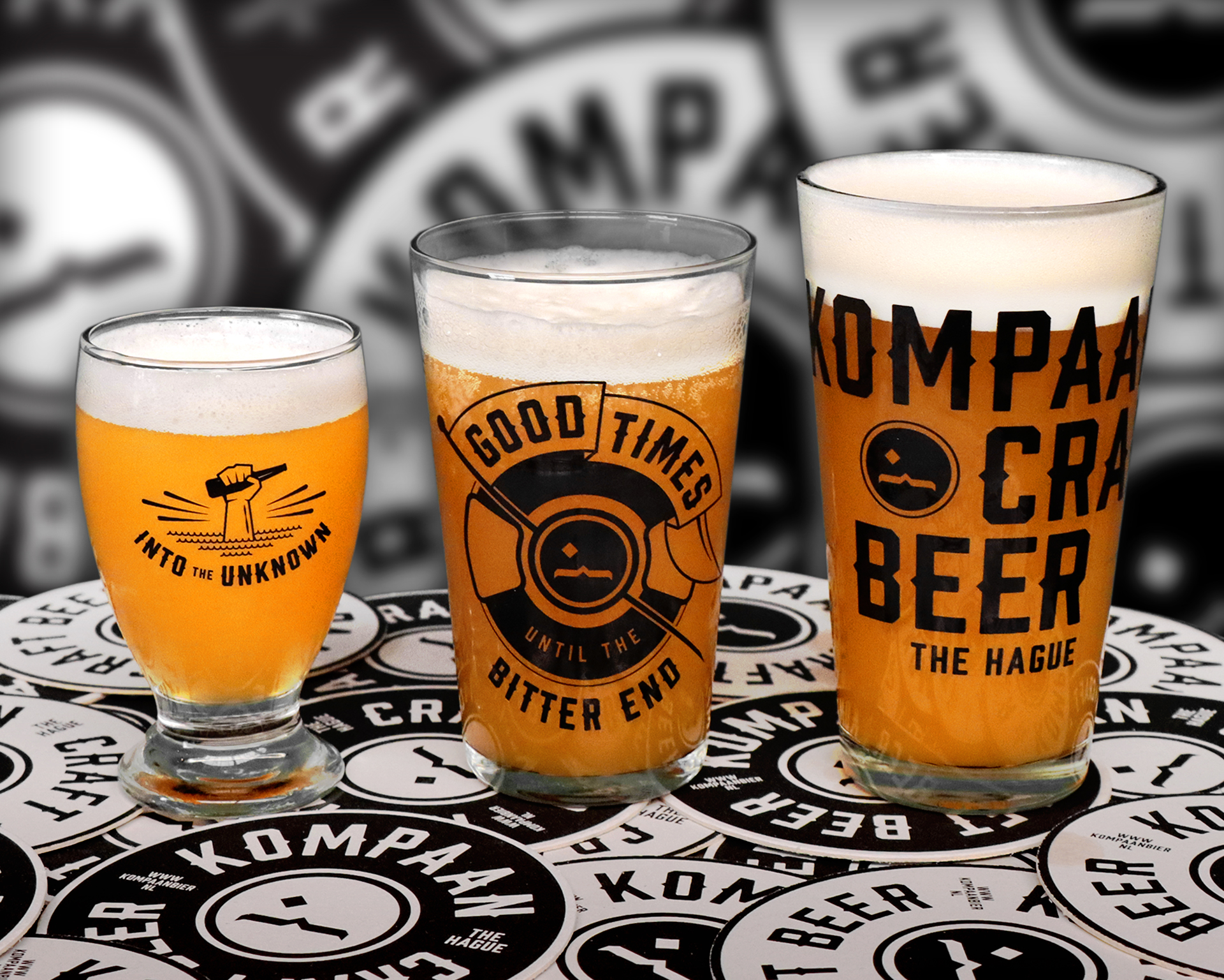
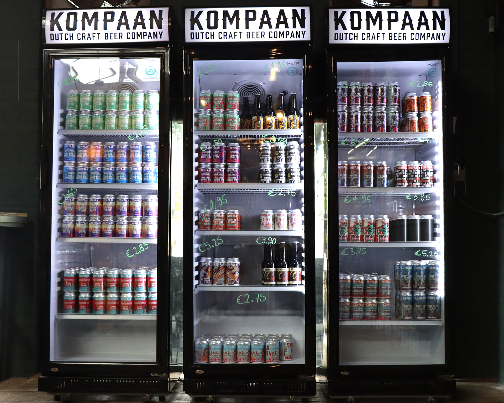
A selection of one-off labels and different beer series we created over the years.