Creme Fraiche
-
Client:
Creme Fraiche Design
-
Type of work:
Identity & Packaging
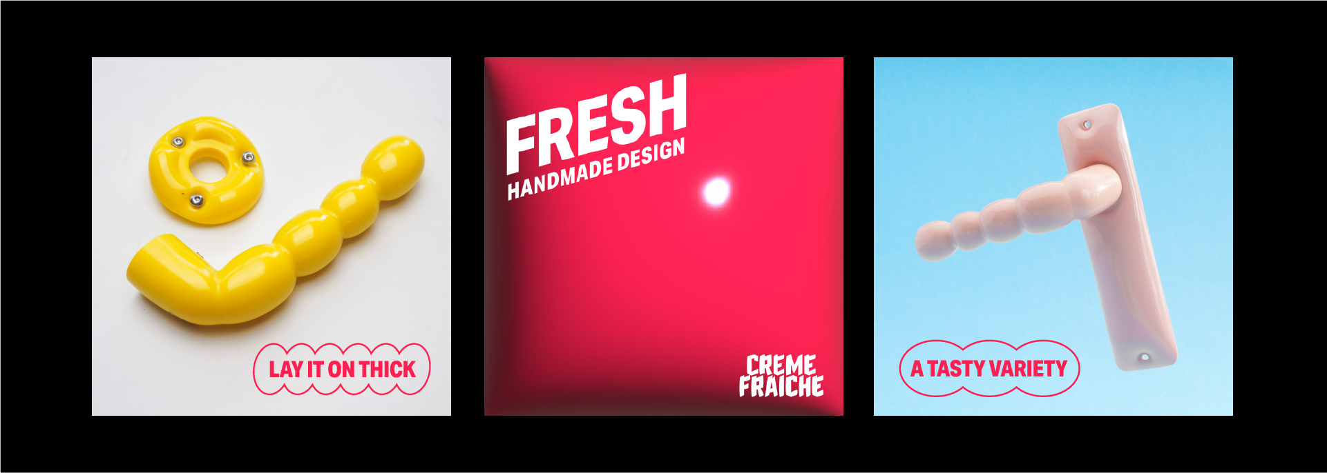
Creme Fraiche is a Rotterdam-based design company that’s freshening up the door game with their handmade show-stopping door handles, knobs and cabinet handles and coasters.
The identity is deliciously rich and fresh as ‘creme fraiche’ and the handles themselves - they practically beg you to reach out and touch them.
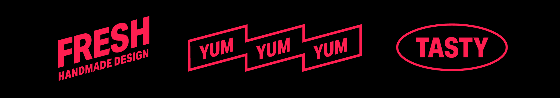
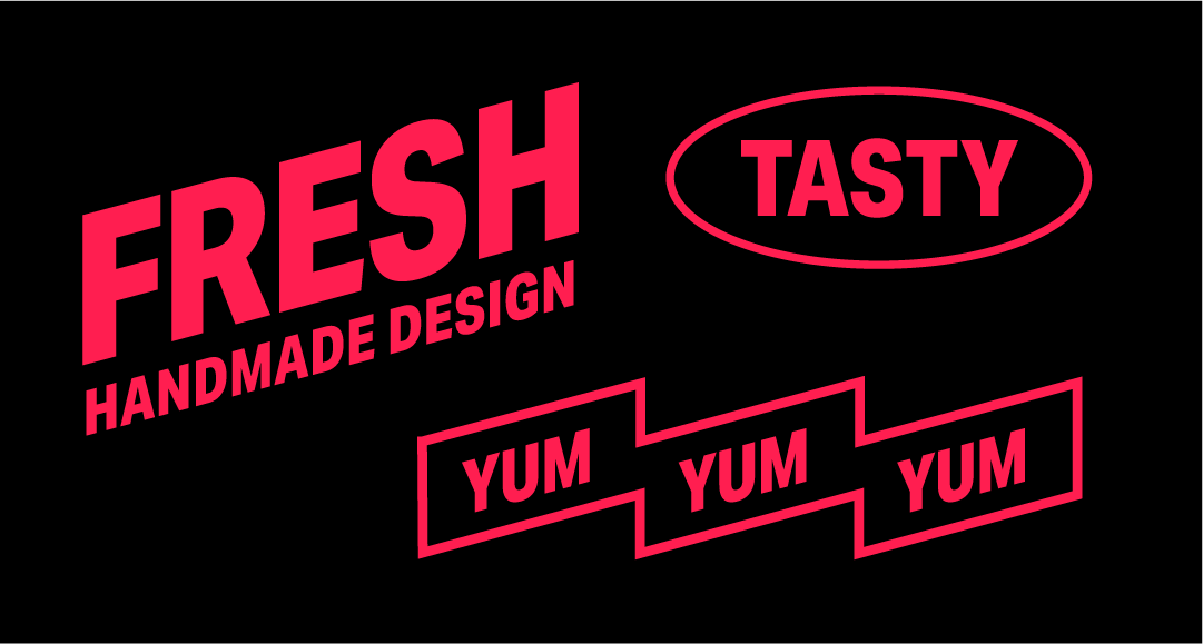
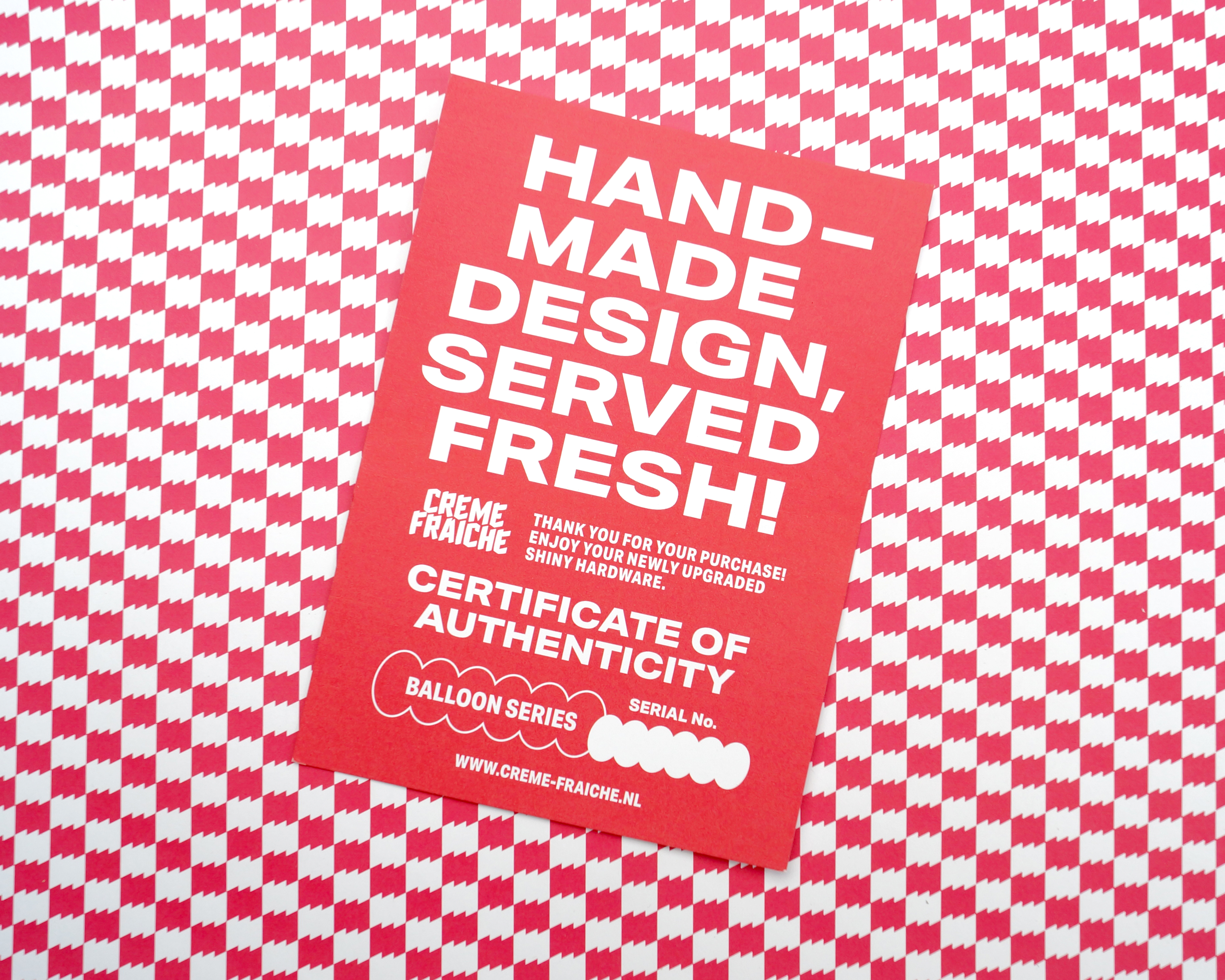
The logo is created the same way as the design process of the handles, deriving from manipulating and casting balloons.
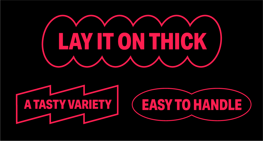
The identity is complemented by a tone of voice playing with the association of the shiny and fresh appearance (and brand name) of the objects, and is all about teasing your senses.
Photography by Creme Fraiche Design

The identity is as playful and vibrant as the objects. We created a font for the logo that mirrors the design process of the door handles, evoking the image of a balloon gently pinched at various points.
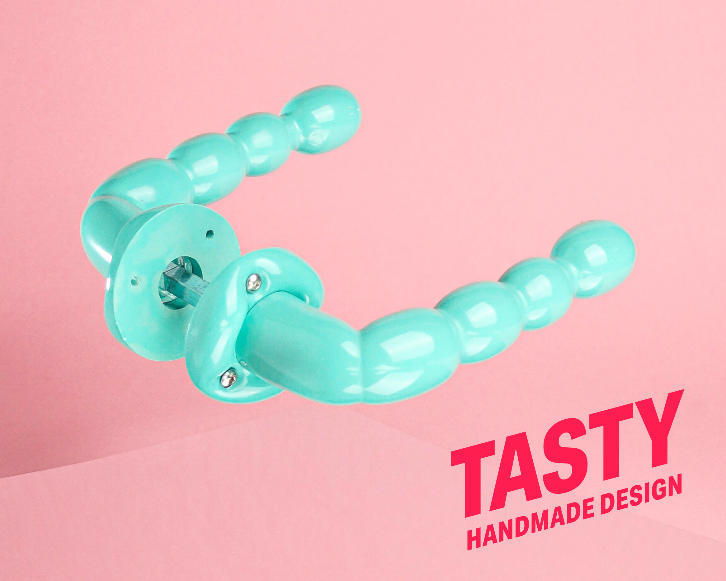
The identity is complemented by a tone of voice playing with the association of the food-like appearance (and brand name) of the objects, and is all about teasing your senses.


For this fresh product we created a fresh packaging. When ordered, the door handles and associated parts will be packaged in vacuum-sealed bags, a tasty nod to the delicious appeal of these handles.

As evidence of the unparalleled quality of the product, the bags are labelled with a batch number and the date it got its seal of freshness, giving each product a personal and unique touch.